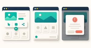
Imagine a pricing page on a phone. The visitor is comparing plans. A chat launcher waits at the bottom right, an offer bar appears at the bottom, and a newsletter pop-up arrives before the visitor reaches the prices. Each team can explain its own choice. None can explain why the visitor should deal with all three before finishing the comparison.
The useful question is not “which pattern converts best?” There is no answer that travels safely from one page to another. Ask what the visitor needs, how long that need lasts, how many choices deserve space, and whether the page may be interrupted. Then choose the smallest pattern that completes that job.
A website toolbar keeps a small set of useful actions available across a journey. A sticky bar keeps one message or action in view while the page moves. A pop-up asks the visitor to respond at a particular moment, sometimes stopping them from using the page until they do. An ordinary link or inline section is a fourth, often overlooked choice.
First, name the job the visitor is doing
“Increase engagement” is not a visitor job. “Find the right plan without losing the comparison” is. So is “get help when the form will not submit”. Write the job in the visitor's words before discussing shapes, colours or triggers.
Then put a time boundary around it. Search or contact may remain useful on many pages. A delivery announcement matters for a short period. A confirmation appears only when someone has taken a particular action. Duration narrows the options, but it does not decide alone: a continuing action can still be easier to find in the normal navigation, and a brief task does not automatically need a pop-up.
Count the choices as well. If several genuinely different routes need recurring access, a toolbar can bring them together. If one campaign message deserves visibility, a restrained sticky bar may fit. If a response is necessary before continuing, a dialog may be right. If the page already makes the next action clear, leave the interface alone.
| Visitor need | Sensible starting point | What could make you change it |
|---|---|---|
| Several useful actions recur across a long journey | Website toolbar | Too many controls crowd mobile; return low-priority routes to navigation or the page. |
| One short message or action remains relevant while reading | Sticky bar | It competes with the page's primary action or covers content. |
| One focused response is needed at a relevant moment | Pop-up or dialog | The same task works inline without blocking the visitor. |
| The next step is already visible in the content | No extra persistent element | Testing shows a specific route is repeatedly missed. |
This is a starting decision, not a claim that one format always performs better.
Use a toolbar when several actions earn repeated access
Here, website toolbar means a component on the site, not the controls at the top of someone's browser. It might hold search, contact, feedback and one booking route. Its promise is continuity: people can find those actions without hunting through a different menu on every page.
That promise weakens when every department adds a button. A toolbar with six competing promotions is another crowded menu, now following the visitor everywhere. Give each action a distinct job and an owner. Ask which route would become harder to find if the toolbar were removed. If the answer is “none”, that action may not need permanent space.
Barrava's current product makes this trade-off visible. Its modules are an ordered array, so their order sets placement. CTA buttons are ordinary modules in that order. An eligible account can use a second CTA to make a dual-CTA result; that second CTA requires Starter or a higher plan. Module and whole-bar visibility can be set by device. Those controls let a team make a considered mobile version, but they cannot decide which actions matter. The product's website toolbar overview is a useful starting point for seeing the pattern; the content choice still belongs to the team.
Test labels at the narrowest supported width. If “Book a consultation about our enterprise platform” no longer fits, shorten the action or remove a lower-priority one. Tiny text is not an information architecture strategy. The main site navigation should still make sense when the toolbar is absent or unavailable.
Use a sticky bar when one continuing priority deserves space
“Sticky bar” is often used for any bar that remains visible, even though the web's sticky and fixed CSS positioning behave differently. Sticky positioning follows the nearest relevant scrolling area; fixed positioning usually stays relative to the screen. The W3C's CSS positioning specification sets out that technical distinction. For the reader's decision, the key point is that the bar remains in sight while other content moves.
A short delivery update, event registration reminder or long-page “Compare plans” route might earn that space. Write one message and one clear action. Give a temporary campaign an owner and an end date. If you need to squeeze search, chat, a survey and two offers into the bar, you are probably asking it to do a toolbar's job.
A slim bar can be a gentler choice than a full-screen promotion. Google Search Central recommends banners that occupy only a small part of the screen when the alternative is an intrusive promotional interstitial. That guidance does not mean every banner is harmless. On a phone, a modest bar can still cover the final form button or sit on top of a consent choice. Inspect the complete page, not just the bar in a design file.
Use a pop-up when a response earns the interruption
A pop-up is a layer that appears over part or all of the page. A modal dialog is the stronger version: while it is open, the rest of the page cannot be used. That can be appropriate when a visitor deliberately opens a booking form, must confirm a consequential action, or must make a required access choice. It is harder to justify for a promotion that appears before someone has understood the page.
For a modal, the interruption is also a technical responsibility. The W3C modal dialog pattern says keyboard focus should move into the dialog, stay inside while it is active, and return to a sensible place when it closes. Escape should close it, and a visible close control should be in the keyboard path. If your team cannot test those behaviours, choose an inline form or link until it can.
Google warns that intrusive promotional dialogs can make content harder to reach for visitors and search engines. This is not a blanket ban on dialogs: the reason, timing and degree of obstruction matter. A necessary age gate and an immediate “Join our newsletter” demand are doing different jobs.
Work through a pricing-page choice
Here is an illustrative scenario, not a Barrava customer result. A software company has a long comparison page. Visitors need to understand the differences between three plans before booking a sales call. Support wants chat available. Marketing wants a webinar promotion. Sales wants a demo CTA visible throughout. A first-visit consent banner also appears.
Start with the visitor's job. The plan comparison and its own “Compare plans” and “Talk through the options” routes are primary. Chat can help if a question arises, but it does not need to interrupt reading. The webinar is related to only one product area and lasts two weeks. Consent has its own separate purpose and needs to remain operable under the site's consent design.
The team tests three proposed layouts at a narrow phone width. In the first, a pop-up offers the webinar on arrival. It hides the plan summary before the visitor has context. In the second, a sticky webinar bar sits above chat and the consent banner. The bottom of the comparison is difficult to use. In the third, a small persistent action layer keeps “Compare plans” and a help route available; the webinar appears as a contextual link next to relevant product information. The third is the starting choice because it supports the page's main job without demanding an unrelated decision. It is a design hypothesis, not a measured winner.
Now test the states the mock-up missed: consent open, chat open, a validation error in the demo form, a long translated label, the phone keyboard raised, and keyboard focus moving through every control. If the toolbar covers the submit button in one of those states, move it, make the page reserve space, hide it for that state, or remove it from that page. The choice is only complete when the visitor can finish the task.
The recommendation changes on a short webinar landing page. There, registration is the main job and the form may already be visible. An extra persistent layer could add no useful route at all. On a long help centre page, search and support may instead justify a toolbar. Same company, different visitor job.
Inspect the bottom edge before release
Persistent controls are most likely to fail at the end of a page or in a crowded mobile state. Walk the page with real copy and production tools, not an empty prototype.
- Scroll to the last link, form field and submit button. Can each move above the persistent element?
- Use Tab and Shift+Tab. Is the focused control still visible? WCAG 2.2's Focus Not Obscured criterion says an author-created layer must not entirely hide a control that has keyboard focus.
- Open chat, consent settings and any feedback form. Decide which control moves, collapses or waits when they meet.
- Try a narrow phone, enlarged text and the on-screen keyboard. Check both the primary action and the way to dismiss an overlay.
- Revisit the page after dismissing a non-essential promotion. Does it respect that choice for an appropriate period?
A bottom control may need extra distance from a device edge. The CSS safe-area specification provides values for visible screen insets. They are implementation aids, not a substitute for looking at the actual page.
Judge the journey, not the most clickable element
Define a useful outcome before launch. A click on “Book a demo” is an interaction; a completed booking is a different event. For a toolbar, record which actions people select and where. For a sticky campaign bar, record selections and dismissals. For a pop-up, record opens, completions and closes. Google Analytics allows events for these interactions, but the team still needs to agree what each event means and how it relates to the real outcome.
Look at the page's primary task and guardrails too: completed forms, qualified enquiries where available, content access, errors and mobile usability. If a pop-up gets many clicks while the comparison task becomes harder, those clicks do not settle the decision. Keep page, audience and message changes as stable as possible when comparing patterns; changing everything together makes the result hard to interpret.
Barrava offers a concrete example of the physical trade-off: its docked toolbar can reserve page-bottom space, while its floating version intentionally overlays the page. Neither setting can tell you whether the selected action deserves that space. Barrava can provide a structured access layer for selected actions; it does not replace a specialist chat provider, consent platform, analytics system or the site's accessibility review.
Choose the pattern after naming the visitor's job, then review it on the finished page. If several actions truly recur, consider a toolbar. If one message needs continuing visibility, try a small bar. If a response is genuinely required now, use a properly built dialog. If none of those conditions holds, let the page do its job without another layer. For a related decision, see how to choose which actions deserve persistent visibility.